Is the World Cup’s ever-changing logo an own-goal?
Every four years, the FIFA World Cup resets the clock, not just on the pitch, but in its branding. Each edition arrives with a starkly different logo, a stark contrast to other global sporting events that have spent decades cementing an instantly recognisable symbol.
That approach has prompted Jake Borlace, marketing scientist at the Ehrenberg-Bass Institute of Marketing Science to ask a simple question: at a time when brands invest heavily in building and reinforcing distinctive assets, why does the world’s largest sporting event keep changing its own?
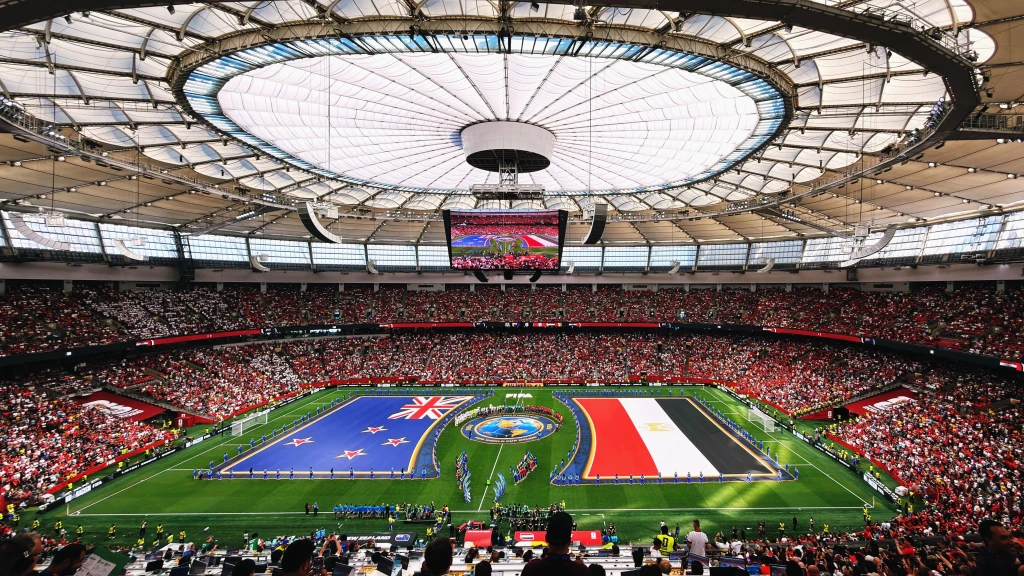
The FIFA World Cup is one of the biggest shows on earth.
In 2022, almost two in five people on the planet watched at least 20 minutes of the tournament. Few events match that scale and excitement, which is why brands pay extraordinary sums to be associated with it. FIFA expects A$3.8b in sponsorship and marketing rights revenue for the 2023–2026 World Cup cycle alone.
Sponsors aren’t just paying for exposure. They’re paying for association. This is why brands advertise sponsorships, and when they do — there are at least two brands that need to be communicated in the ad.
Logos, symbols and imagery act as mental shortcuts that help signal the brand to consumers. In marketing, these cues are known as distinctive assets — non-name elements such as colours, shapes or symbols that help audiences recognise and recall an entity quickly. Think the golden arches of McDonald’s, Nike’s swoosh or Apple’s bitten apple.
While often discussed in relation to brands, events build distinctive assets too. Many of the world’s biggest sporting properties rely on enduring visual cues that instantly signal the event. The Olympic rings, the Super Bowl’s Lombardi Trophy, and the UEFA Champions League star-ball all act as distinctive assets that audiences quickly recognise and recall.
The FIFA World Cup, however, has rarely followed this playbook. Rather than building a consistent symbol over time, each tournament introduces a new logo. The 2026 logo takes this approach even further.
Stripped back to just “FIFA”, “26”, and the World Cup trophy, the design does not even include the words “World Cup”. Recognition therefore relies heavily on whether audiences link the trophy symbol and governing body to the tournament.
What does this mean for the FIFA trophy as a distinctive asset?
In January 2026, the Ehrenberg-Bass Institute showed the FIFA World Cup trophy to around 500 people across the United States and asked them to name the global sporting event it represented.
Only 19% correctly linked it to the FIFA World Cup.
The Institute also asked respondents if they could identify the global sporting events organised by FIFA. Only 13% were able to name the World Cup.
Read the full article in Mumbrella.